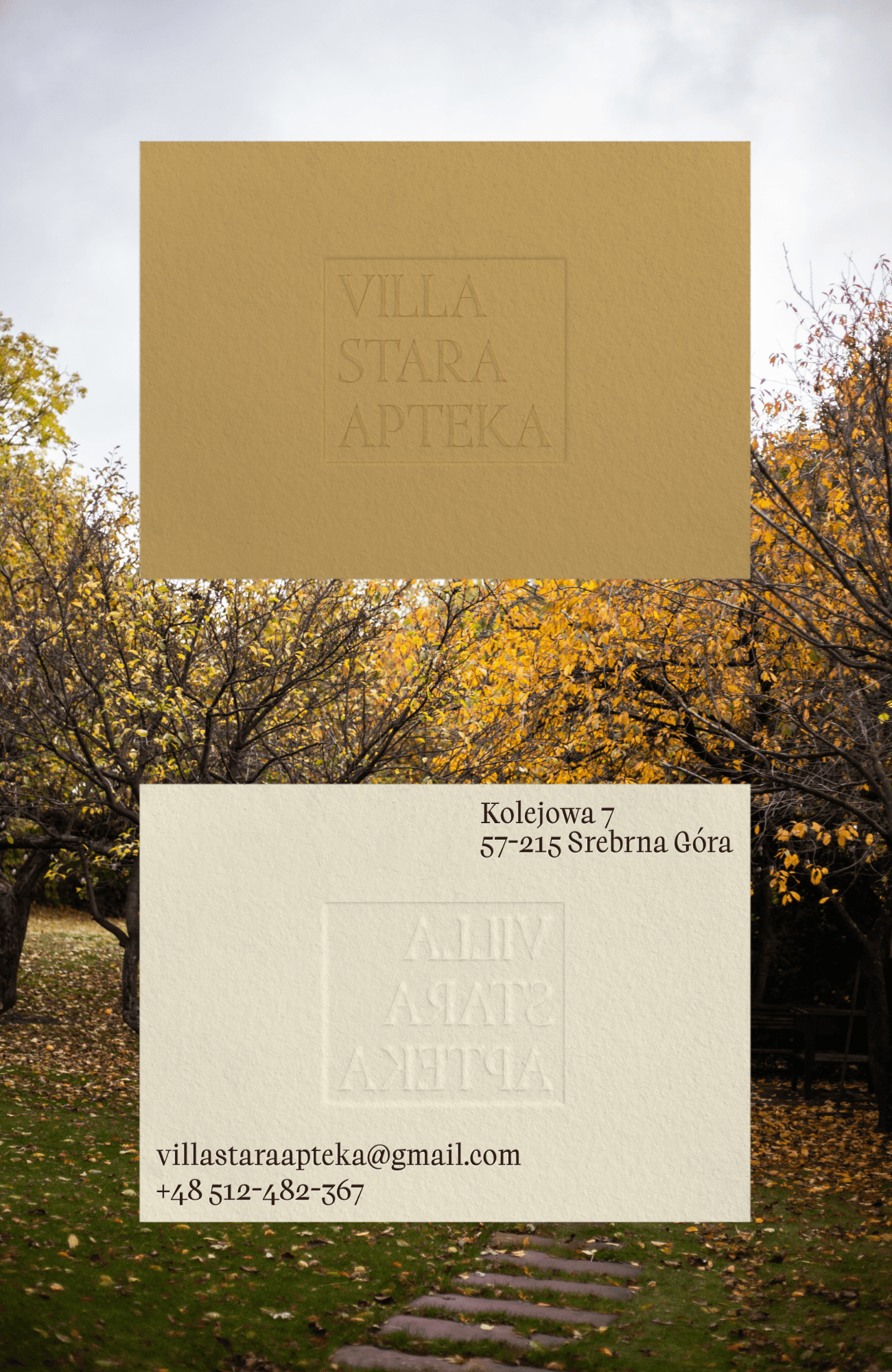
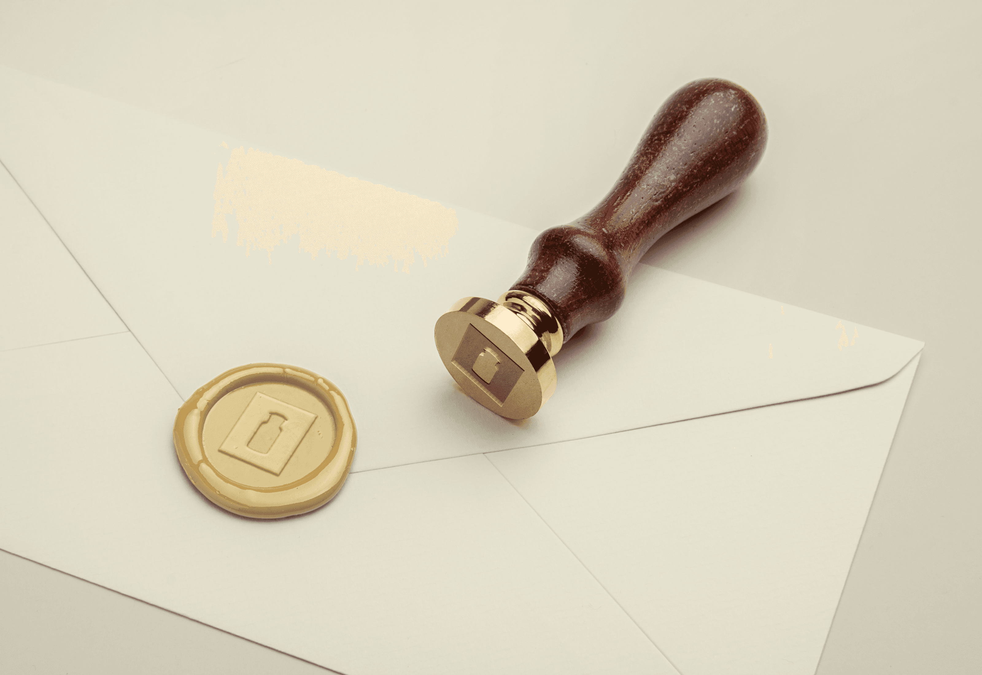
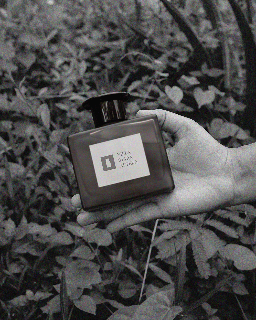
VILLA STARA APTEKA BRANDING
The moment I stepped into Villa Stara Apteka, I knew this wasn't just another retreat space. The original apothecary bottles with their faded labels and mysterious residues stood like silent witnesses to the building's past. These became my muse in crafting an identity that would whisper rather than shout its history. Working closely with the owners, we developed a visual language that treats the villa's heritage with reverence while making it relevant for today's wellness seekers. The logo emerged from studying century old prescriptions, its letterforms carrying just a hint of that medicinal precision. We paired it with a restrained color palette inspired by the oxidation on old glass bottles muted greens and warm ambers that change tone in different lights, much like the building itself.
Client
VILLA STARA APTEKA
DELIVERABLES
Animation Branding
Year
2024
Role
BRANDING